Cocoon
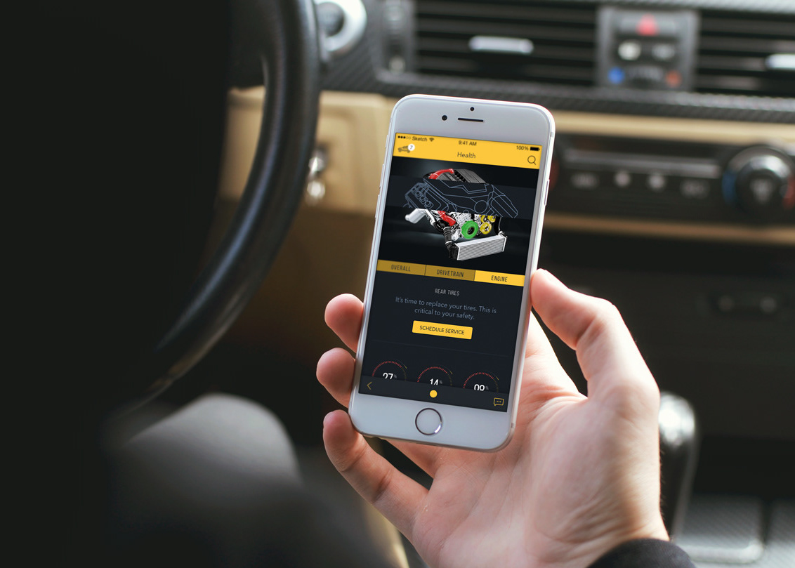
Cocoon is a mobile app that helps parents schedule rides for children who participate in after-school activities. Through the app, parents can see activity calendars, join teams or groups, and schedule rides for their kids with parents they already trust and know. Designing Cocoon presented the challenge of creating an experience that is fun and friendly, but also feels safe and secure.
On this project, I was the only designer, and I worked closely with Cocoon's product manager and the VP of Technology to deliver the MVP wireframes and visual designs.
Discovery & Research
Our team conducted user interviews with parents and coaches. This gave us insight into their greatest pain points and which features mattered to them the most. Parents expressed frustration with existing systems that were not effective or easy to use. Many parents struggled to find rides at the last minute and ended up paying their older kids or college students for rides. At the time, there was no single website or app that effectively allowed parents to track event schedules and coordinate rides.
This knowledge helped us identify the key features Cocoon needed for the MVP launch. I received a list of user stories to kick off the wireframing process and ensure that the most important functionality would be built into the app. Designing from this perspective ensured that the user was always at the forefront of my design decisions, and created a functional foundation for the overall app experience.
Design & Ideation
To start, I focused on designing the adult-facing app experience. Our team was building Cocoon from the ground up, and I started designing right where the user first meets Cocoon: onboarding.
The original onboarding flow required the user to enter their home address, all of their child’s personal details, an emergency contact, and optionally, vehicle and driver information. Oh, and complete a background check. In one single flow, with no option to save or come back later.
After completing low-fidelity wires for this flow, I knew the team would have to rethink how and when we asked users for their personal information. From a user’s perspective, it’s unlikely that anyone would be willing to volunteer such an extensive amount of personal information before exploring the app and discovering its full value.
Initially, our team had decided to require this information upfront partially to ensure the safety of the children who would receive rides through the app. However, the complexity of the onboarding experience presented a greater problem, in that no one would even schedule a ride if they couldn’t make it through the onboarding flow in the first place. We realized this would hinder the number of active users we would have after the launch, and quickly made a new plan.
After discussing with the team, we decided to segment the onboarding experience to require minimum personal information upfront. In the revised flow, the user is prompted to add more information once the basic account creation is complete (email, password, photo), and then again during key interactions throughout the app. For example, if a parent tries to schedule a ride, they will be prompted to first add their child to the system before completing their ride request.
Additionally, the user will see a persistent notification within the notifications panel to complete their profile. After two weeks, the notification will disappear, as not all users will complete every section of their profile, like becoming a driver or coach.
After working out the kinks in the user flows, I scaled the wireframes from low to high fidelity and began building a clickable prototype with InVision for user testing.
Project Status
More information is available at ridecocoon.com.


